
Ad Gefrin
This is one of the favourite brands that I have designed.
For many years I had been fascinated by a roadside monument near Wooler in Northumberland marking the site of Ad Gefrin, so I already had an interest in,
and understanding of what Ad Gefrin was when the brief arrived on my desk for a
new Distillery.
Ad Gefrin was the Royal Palace of the Kings of Northumbria in the 7th Century.
I instinctively felt that the brand should reflect the Anglo-Saxon period. Insular Art,
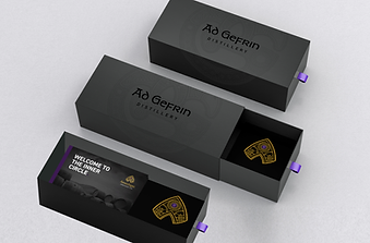
also known as Hiberno-Saxon art, emerged in the British Isles during the early medieval period (Insular is Latin for Island). It blends Celtic, Anglo-Saxon, and Christian traditions and is characterised by intricate interlaced patterns. Ad Gerfin means ‘By the Hill of Goats.’
I therefore created the icon you see here, incorporating the letters ‘A’ and 'G’ and an insular stylised goat. Not a phrase I ever thought I’d use!
CGI animation by Allan Cooke - Ad Gefrin font has changed since launch.


Packaging design by Phil Tait- bottle shape inspired by the Cheviot Hills, not adopted.